Olly Moss


- Olly Moss designs really effective posters, which are very like the work of Saul Bass.
- I'm particularly fond of the poster for 'An American Werewolf in London' which I think is perfect. I haven't seen the movie but I can tell it is incredibly fitting. The use of red is actually great, something which I can be a bit iffy about because of its predictability in this context.
- The white typeface is gorgeous and effortless, something I am trying to create with my own designs. It has a perfect level of creepy and frightening.
- The werewolf in the map of the UK is brilliantly executed and is extremely effective. Makes me want to watch the film!
Saul Bass


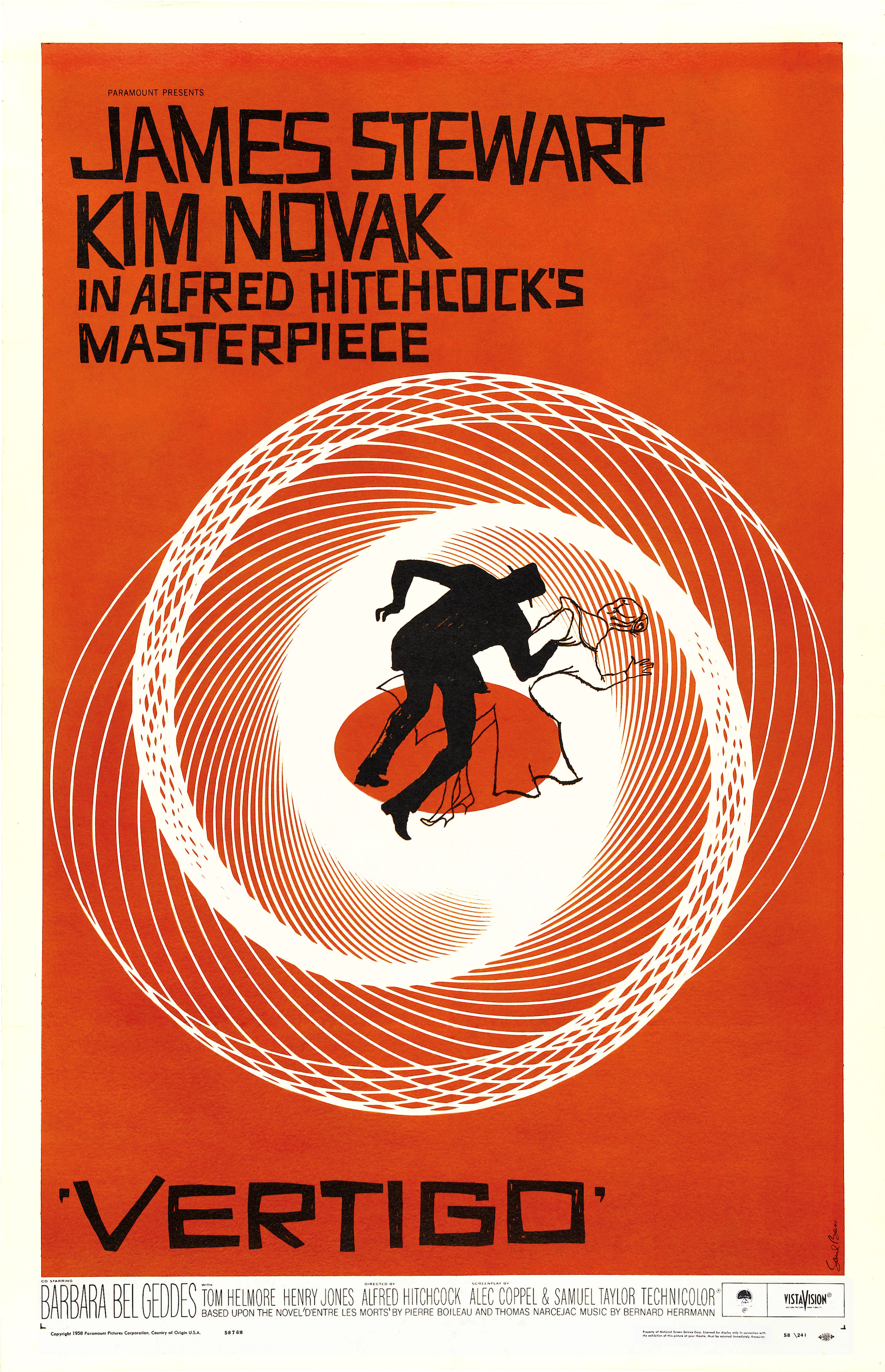
- The orange colour is definitely a signature of Bass' work, which is why I prefer it when other movie poster designers steer clear from it as it is too distinctive.
- Saul Bass' work is iconic because of his clear style of working, which I really like. However, maybe the orange isn't always fitting? I think with 'Vertigo', a blue colour would be better, which I have actually seen on a print of a poster in my house. I prefer it that way.
- However I am very inspired by his solid use of colour, as it is striking; I would like to use a similar effect on my own posters.
No comments:
Post a Comment