I looked on the Alternative Movie Poster website to get some inspiration from some alternative posters. Here are some that caught my eye.
 |
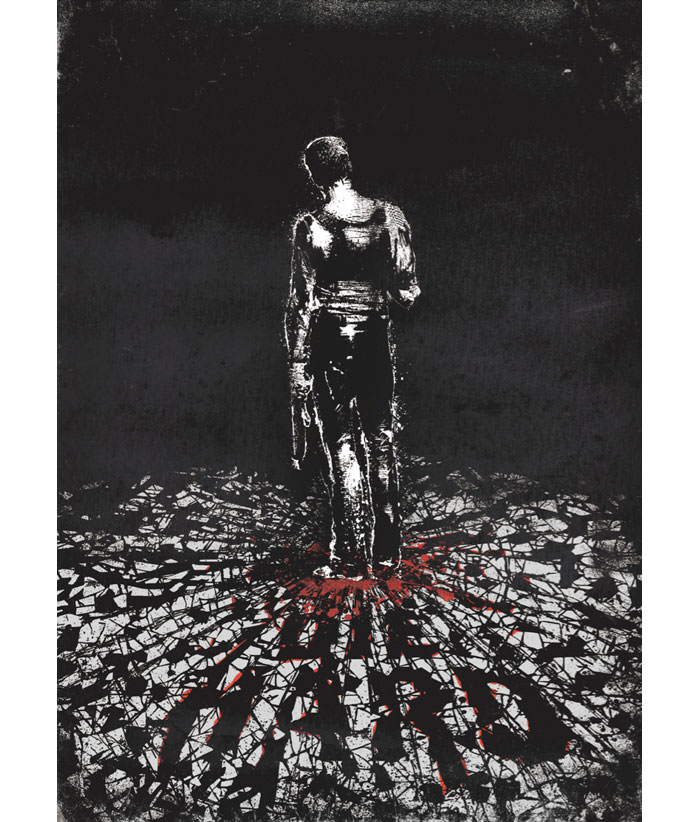
| Die Hard by Daniel Norris |
I like the hand rendered style of this, I think it's overall really powerful. I like Norris' look and feel; he designed one of the Clockwork Orange Posters that are below. Very gritty, sketchy and simple.
 |
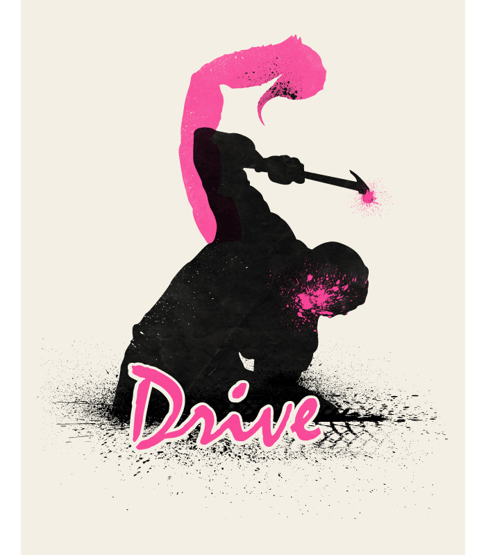
| Drive by Beware1984 |
 |
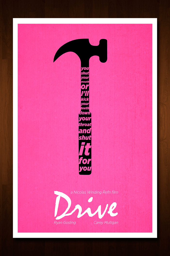
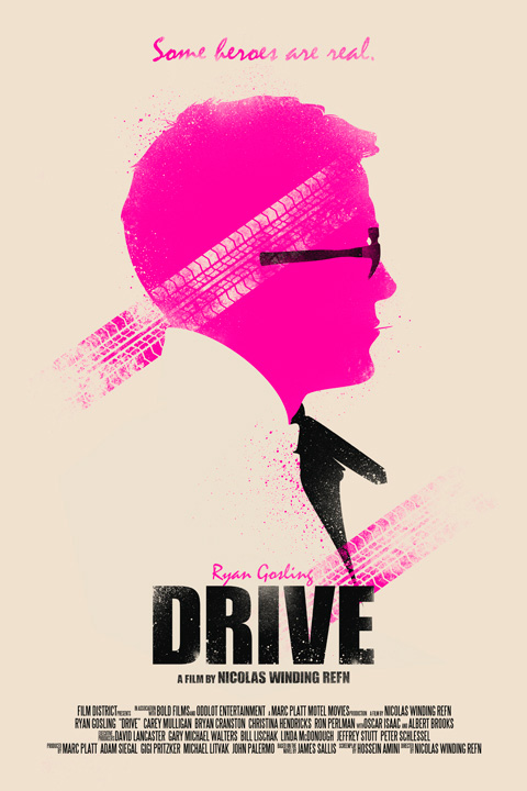
| Drive by Nick Morrison |
 |
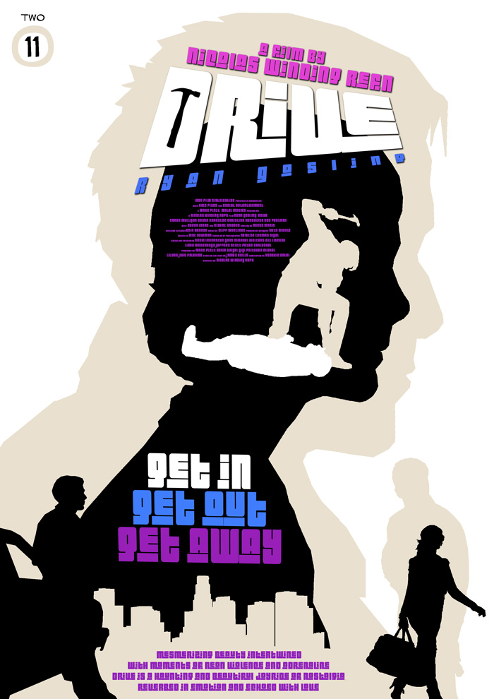
| Drive by Russell Ford |
 |
| Drive by Art Dilly |
 |
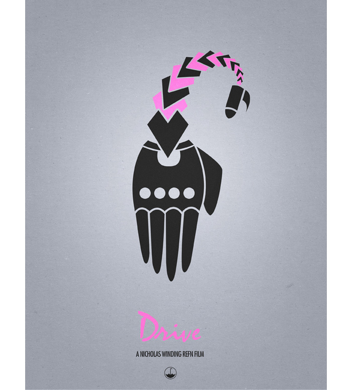
| Drive by Ian Wilding |
- I really am fond of most of the Drive alt. posters I've seen. I'd like to see other colours used to see what would happen, however pink and purple work amazingly with this film.
- However, the poster shown here with the hand... I don't understand it and I feel like its very robotic. It reminds me of a robot hand. It took me a while to figure out that it is supposed to look like a scorpion which relates to Ryan Gosling's jacket in the film.
- I also feel that the design before it, by Russell Ford, is too much like the branding of the video game Grand Theft Auto. The style is cool but it makes it feel generic and quite emotionless which it isn't; it is the opposite.
- These posters show that using 2 colours doesn't have to be restricting in any way. All these posters are successful because of how simplistic and straightforward they are; this makes them very hard hitting, especially if you know the plot of the film.
- I think that using pink in this context is using graphic design for good, as I am personally quite strongly against gender stereotypes and think they need to be broken. Semiotics is important but its also important to be brave with design and change it up. It also makes the film stand out from the rest of action movies when it isn't colour red or blue.
 |
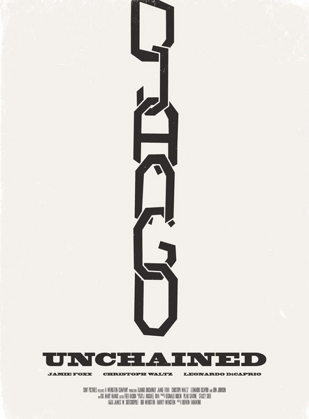
| Django Unchained by Aron Jones |
- Using type as image/image as type can be really effective and immediately it makes people notice it that little bit more. This poster is very minimal but really gets across the message of the movie in a subtle way. However, I'd like to see some colour used in it carefully.
 |
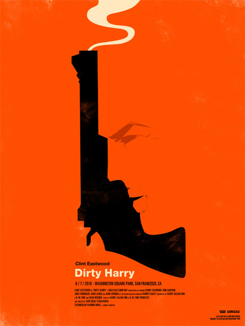
| Dirty Harry by Olly Moss |
- I personally think using negative space is always a great move, and this movie poster proves that.
- Although I'd like to know why there is such a vivid orange used; it will always remind me of advertising for products like Orange.
 |
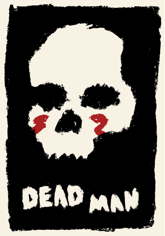
| Dead Man by Jake Longoria |
- I'm really fond of the sketchy rough style of this poster although it doesn't immediately make itself clear that is it a movie poster.
- Regardless of this I'd love to take inspiration from it.
 |
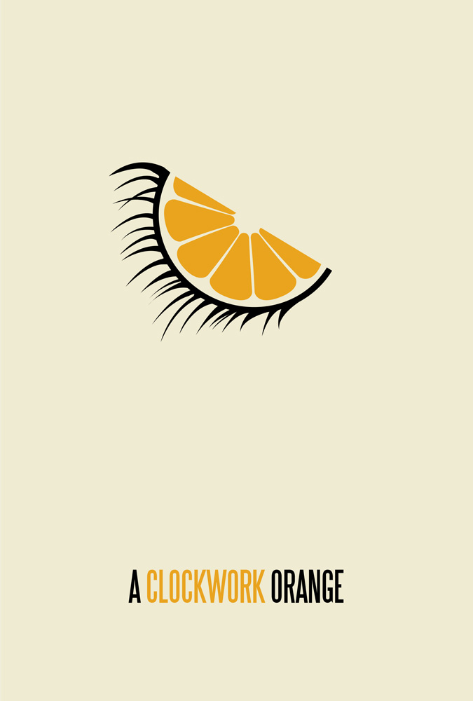
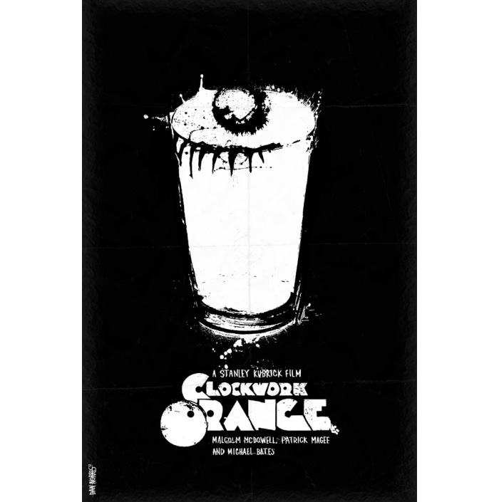
| A Clockwork Orange by Brickhut |
 |
| A Clockwork Orange by Daniel Norris |
- Both these Clockwork Orange posters stuck out to me, because they both use clever imagery so well.
- I like the orange/eye imagery however I'm not too fond of the typeface chosen with it. It is too plain for the film.
- The typeface for the second poster however is incredibly fitting to both the image and the movie.
 |
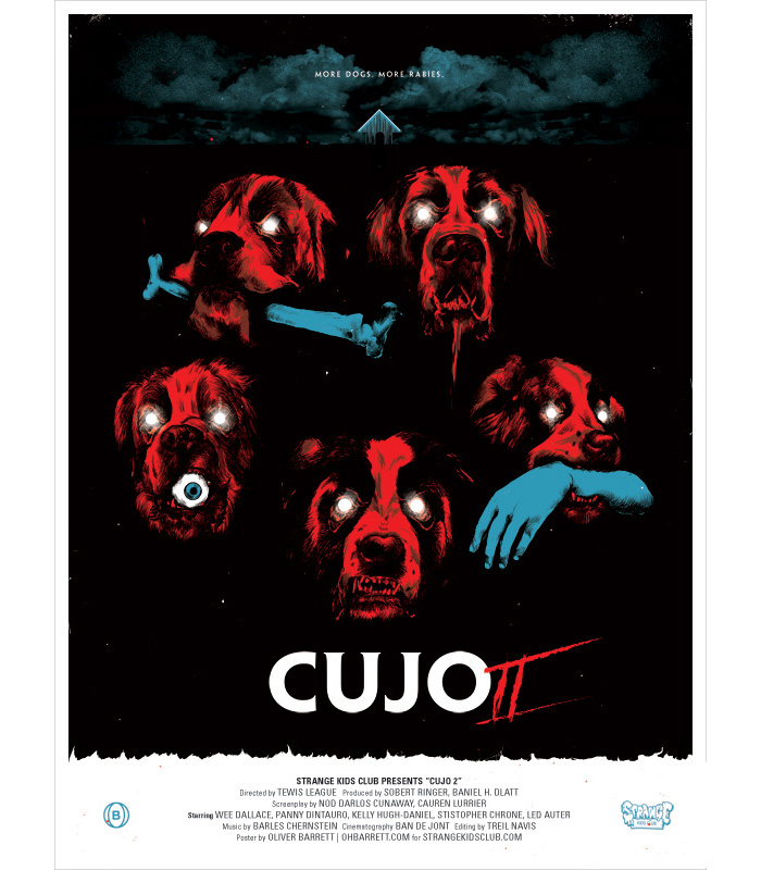
| Cujo by Oliver Barrett |
- I love this poster and it's vivid colours. It's frightening and immediately tells me -someone who has never seen the film- that it is a horror movie.
- It's very effective because dogs are seen as 'man's best friend', and here they are the opposite - the enemy. Makes me wonder what the hell happens in the film.
No comments:
Post a Comment