Monday 31 March 2014

Studio Brief 2: Publication research


"WEEPIES" is a statement - a feminine one. From Sartre's idea of "perfect moment", depicted in his Nausea novel, and its association with the image of the women in movies disserted in Debora Holdestein's arcticle for Jum Cut Magazine, here, are presented a series of different examples which depict the fictional woman. These characters, mainly offer us a vision of the woman submissive to a male figure. Based on a personal connection, these association have the goal to unite in a single view, the recognition of patterns of women's image representation, and altogether serve as a metaphor for the concept of stereotype. A critic methapor, which ambition is enhance the negative power of ideology that, more than producing global pictures, turns them into desirable and common accepted, distorted realities.
I like the contrast between the colours of the papers, and the handwritten typography which I find is often a lot more effective than chosen typefaces.
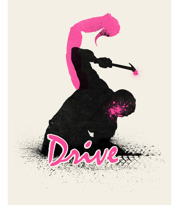
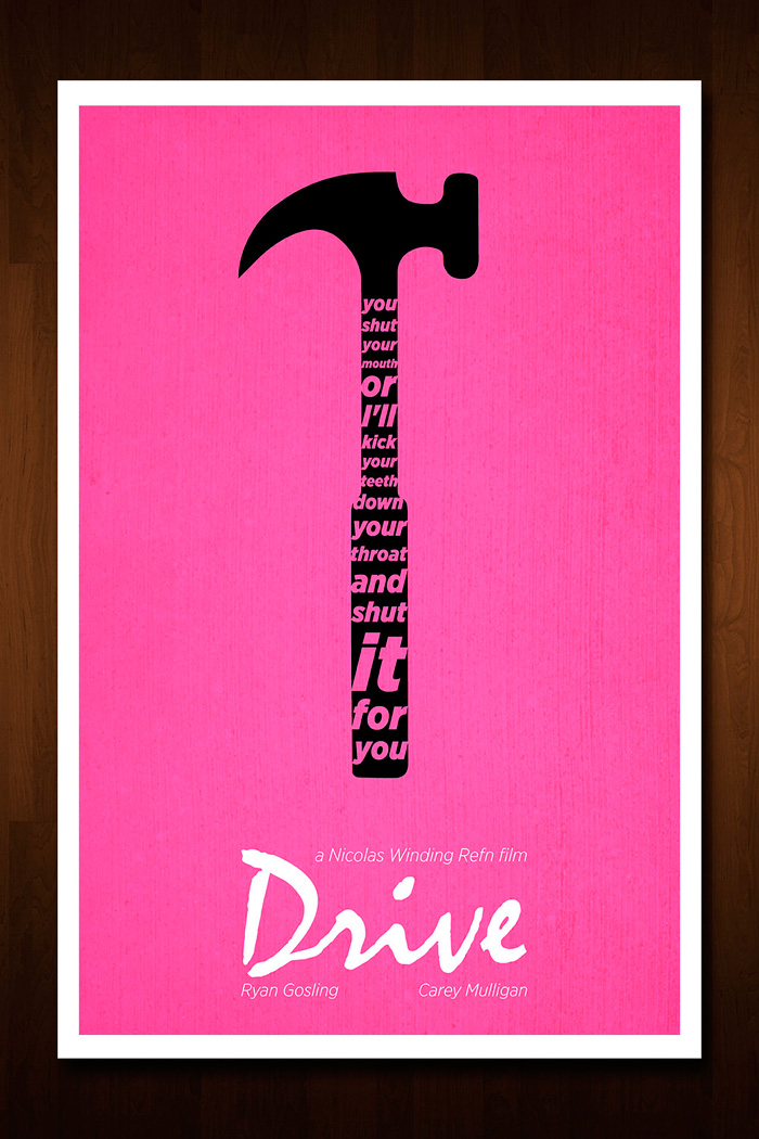
However, I feel like the pink colour used in the book is stereotypically feminine - this is quite unoriginal and should be broken if possible in graphic design.

Sunday 30 March 2014

Studio Brief 3: Final Crit


filled in text at bottom - hard to read
hand rendered type - looks like a proper typeface
green works even though its meant to be turquoise
the border works

We sat in groups of around 12 for the final crit of our Bruce Willis movie posters. The feedback I received about my poster was mostly good.
  • The text at the bottom would look better if it was filled in black rather than just outlined - it is quite hard to read unless you're up close to it.
  • The hand rendered movie title looks like a proper typeface and works really well.
  • The green background is successful, even though it was meant to turn out turquoise.
  • The white border is effective, as it gives it room to breathe and there is space for the cast names.
I agree that the text at the bottom of the page would be more legible filled in - however I like the minimal effect the thin outlining gives as it doen't distract from the imagery. But its not practical.


Thursday 27 March 2014

Studio Brief 2: Proposal presentation/crit

On tuesday I presented my two ideas to the group with a simple powerpoint that outlined what I hope to do.


Feedback - idea 1:
  • The first idea is the stronger one, could be interesting
  • Maybe use a spinning wheel in the publication, to make it interactive and people get options of which page to go to
Feedback - idea 2:
  • Would be hard to make the publication not superficial, as it is the use of advertisements
After the crit I definitely prefer the first idea, as it is more fitting to my knowledge and my essay. It also interests me a lot more, and is something I will enjoy developing, both content-wise and aesthetically.

Monday 24 March 2014

Studio Brief 2: Publication research - Aufuldish & Warinner

David Maisel's 'Oblivion' series

Views Los Angeles from above and in negative.
'The photographs have an extremely disquieting quality, especially in negative. Our design strategy was to frame the images with monumental formality.'


I love the simplicity of this book and how it is almost dramatic in it's aesthetics because of the negative effect. The white space emphasizes this and makes it really clean looking.

Sunday 23 March 2014

Studio Brief 2: Negative space research

I have found classic example of negative space being used effectively in graphic design on the internet, using various sites including:
http://www.larryeeles.com/negative-space/
http://www.creativebloq.com/art/art-negative-space-8133765


All of these examples are amazingly effective and could feature in my publication if I choose to go with this idea.

Studio Brief 2: Fine art and graphic design: which do you find more valuable? - Idea 1 development

Here are some short statements that sum up parts of my essay, that I would use in the publication if I
choose this idea.

Is design only something that is made in relation to consumerism? 

or can a designer create something for their own fulfillment? Does it then become art? 

Fine art can only truly be, one hundred percent, about self-fulfillment if money is not an issue for the artist. 

Another difference between art and design which could affect the supposed ‘value’ of a piece, is the production methods. 

Graphic design as a whole is fuelled by creativity just as much as fine art. 

Art leaves it up to the viewer to interpret in their own way, and immerses them in a whole new world.

I'm not sure yet whether I would use imagery in the book, or just use the power of typography and make it very simple.
I also had the idea of introducing a 'true or false' system into the publication, which would sum up by the end what the reader thinks.


Thursday 20 March 2014

Studio Brief 2: Publication - Initial ideas


Initial ideas:
  • key points taken from essay - question format? page for each?
  • white space being used as an effective technique - advertising? eg Fedex
  • expand on small area of essay - eg 'designers vs. artists'
  • fine art movements and design movements - how they tie together
  • production methods - art vs design
From these ideas, the ones I think are strongest are the first three above.


Key essay points

  • For this idea, I could simply name the publication "Fine art and graphic design: which do you find more valuable?" and make the reader ponder their thoughts about both practices.
  • I think it could possibly spark controversial debate, as I know that this topic is quite heated amongst some artists and designers. Art and design are seen as opposing forms of creativity, and often a designer will disvalue fine art, or an artist disvalue graphic design.
  • Not sure how much text I would include: simple statement or explain the argument?


Key essay points
  • For this idea I'd like to make a very simple publication with artists and designers. Each spread could have a designer and an artist, each with a page of their own.
  • Maybe I could even collaborate their work to make some layered work to make people think a little differently about what exactly art and design are.
  • Mostly image based.
  • The colour schemes throughout could be different for the artists and the designers, so it is clear which is which.

Negative space in graphic design
  • This idea comes from the FedEx logo that I analysed in my essay, which made me think that exploring a wider range of negative space may be interesting. 
  • I could expand on what I wrote in my essay about how it makes the graphics very memorable resulting in effective advertising.

Wednesday 19 March 2014

Studio Brief 2: Theory into Practice - starting points

For this Context of Practice brief, we have been given the task of creating a publication that is a visual response to the first half of the OUGD401 module. It will take into account what we have learnt through seminars, lectures and tasks, as well as the 3000 essay we wrote on a certain subject.

My essay answered the question:
Could it be argued that fine art ought to be assigned more ‘value’ than more popular forms of visual communication?

Below are the introduction and some key points to work from.
Fine art and forms of visual communication, for example graphic design, are created for different purposes. But are they as dissimilar as people may think? Dictionary definitions propose incredible differences between the two. The following is the definition of art: ‘[mass noun] the expression or application of human creative skill and imagination, typically in a visual form such as painting or sculpture, producing works to be appreciated primarily for their beauty or emotional power.’ (Oxford Dictionaries, 2001). Whereas the graphic design definition is as follows: ‘the art or skill of combining text and pictures in advertisements, magazines, or books.’ (Oxford Dictionaries, 2001).  ‘Art’ is seen as an incredibly emotional and creative formation that artists pour their hearts into whereas ‘graphic design’ seems like a straightforward and painless task that is quite inhuman in comparison. ‘We build elaborate temples to house art and we worship artists with a fervour that was once reserved for saints.’ (Buck L. & Dodd P., 1991). Whether or not fine art ought to be assigned more ‘value’ than more popular forms of visual communication depends on who you ask and the circumstances. Reproduction, function, meaning and creativity are some of the factors that must be taken into account when contemplating the value of such visual pieces.

  • The first thing that comes to mind when comparing fine art and graphic design is the obvious difference between the creators. A ‘designer’ is, most of the time, somebody who creates a consumer product or design.
  • Is design only something that is made in relation to consumerism or can a designer create something for their own fulfilment? Does it then become art?
  • Artists are seen as working for themselves and fulfilling their own set goals; they are the ultimate independent creative figures in society as there is nothing holding them back.
  • Successful artists are thought of as original in all their works, yet some (if they can still be referred to as an artist; to most they can and will) are assigned commissions.
  • Fine art can only truly be, one hundred percent, about self-fulfilment if money is not an issue for the artist.
  • Graphic design has ‘social, cultural and economic’ functions as a whole, Bernard (2005) states. But individually the functions that are in designs consist of information, persuasion, ‘decoration’ and ‘magic’ (Bernard, 2005). Each of these has their own purpose.
  • Graphic design has the ability to transform one thing into something else; ‘making things appear and turning one thing into another thing are exactly what magicians do and that is exactly why graphics may be said to have a magical function, however residual, or primitive it may sound.’ (Bernard, 2005). Art is simply selling its aesthetic at times, and others simply selling its contextual depth. To say it has functions in the same way as design would be incorrect, art is for entertainment.
  • Graphic design and art often have something in common: a concept can make them more interesting and appealing. Art with meaning behind it (even if it is unclear) is often more captivating, and the same can go for mass media such as graphic design.
  • Art is often dubious, and known for its unclear meaning.
  • Art is a form of intriguing self-expression. In comparison, graphic design is not admired for any deep contextual mystery but is known for communicating a clear message.
  • Art leaves it up to the viewer to interpret in their own way, and immerses them in a whole new world.
  • Another difference between art and design which could affect the supposed ‘value’ of a piece, is the production methods.
  • The difference in value of graphic design and fine art lies in the meaning behind it, and there are several variables that make the line between art and design difficult and unclear.
  • graphic design as a whole is fuelled by creativity just as much as fine art, without a doubt. 


Tuesday 18 March 2014

Studio Brief 3: Interim Crit


Above are the mock ups I presented at the crit by laying them out on the table with three questions which were:
  1. Which design should I develop further?
  2. Colours... black/red, or blue/red? Or others?
  3. Feedback?
Key points of the feedback:
  • The briefcase design is the best but a little obvious.
  • The briefcase should be closed because it is being chased after.
  • The cracked designs are successfully simplistic.
  • The briefcase could be brought into another design somehow.
  • Make the colours link to the film.
  • Use blue and red.
  • Experiment with reds.
  • Red and black is very overdone with movie posters.
  • The briefcase typeface gives off a darker sense and feel.
I feel like it was hard for people to give proper feedback because they haven't seen the film, also my designs are in their very early stages.
Even though people are telling me to use red, I really want to try and avoid it because it is so overdone and boring in this context. 


    Sunday 16 March 2014

    Studio Brief 3: Movie Poster research

    Olly Moss


    • Olly Moss designs really effective posters, which are very like the work of Saul Bass.
    • I'm particularly fond of the poster for 'An American Werewolf in London' which I think is perfect. I haven't seen the movie but I can tell it is incredibly fitting. The use of red is actually great, something which I can be a bit iffy about because of its predictability in this context.
    • The white typeface is gorgeous and effortless, something I am trying to create with my own designs. It has a perfect level of creepy and frightening.
    • The werewolf in the map of the UK is brilliantly executed and is extremely effective. Makes me want to watch the film!


    Saul Bass


    • The orange colour is definitely a signature of Bass' work, which is why I prefer it when other movie poster designers steer clear from it as it is too distinctive.
    • Saul Bass' work is iconic because of his clear style of working, which I really like. However, maybe the orange isn't always fitting? I think with 'Vertigo', a blue colour would be better, which I have actually seen on a print of a poster in my house. I prefer it that way.
    • However I am very inspired by his solid use of colour, as it is striking; I would like to use a similar effect on my own posters.

    Studio Brief 3: Movie posters for 'The Cold Light of Day'


    I didn't find many poster variations for this film, mostly because it's not widely popular, nor does it have a cult following of any kind. The posters I did find are all very similar to one another:

    • All text in bold capitals
    • Colours: blue, black, red, white
    • Photograph of protagonist wielding a gun
    • Photograph of protagonist's father, played by Bruce Willis
    • Backdrop of European style buildings

    Thursday 13 March 2014

    Studio Brief 3: AMP Research


    I looked on the Alternative Movie Poster website to get some inspiration from some alternative posters. Here are some that caught my eye.

    Die Hard by Daniel Norris
    I like the hand rendered style of this, I think it's overall really powerful. I like Norris' look and feel; he designed one of the Clockwork Orange Posters that are below. Very gritty, sketchy and simple.

    Drive by Beware1984

    Drive by Nick Morrison

    Drive by Russell Ford


    Drive by Art Dilly

    Drive by Ian Wilding

    • I really am fond of most of the Drive alt. posters I've seen. I'd like to see other colours used to see what would happen, however pink and purple work amazingly with this film.
    • However, the poster shown here with the hand... I don't understand it and I feel like its very robotic. It reminds me of a robot hand. It took me a while to figure out that it is supposed to look like a scorpion which relates to Ryan Gosling's jacket in the film.
    • I also feel that the design before it, by Russell Ford, is too much like the branding of the video game Grand Theft Auto. The style is cool but it makes it feel generic and quite emotionless which it isn't; it is the opposite.
    • These posters show that using 2 colours doesn't have to be restricting in any way. All these posters are successful because of how simplistic and straightforward they are; this makes them very hard hitting, especially if you know the plot of the film.
    • I think that using pink in this context is using graphic design for good, as I am personally quite strongly against gender stereotypes and think they need to be broken. Semiotics is important but its also important to be brave with design and change it up. It also makes the film stand out from the rest of action movies when it isn't colour red or blue.


    Django Unchained by Aron Jones
    • Using type as image/image as type can be really effective and immediately it makes people notice it that little bit more. This poster is very minimal but really gets across the message of the movie in a subtle way. However, I'd like to see some colour used in it carefully.

    Dirty Harry by Olly Moss
    • I personally think using negative space is always a great move, and this movie poster proves that.
    • Although I'd like to know why there is such a vivid orange used; it will always remind me of advertising for products like Orange.

    Dead Man by Jake Longoria

    • I'm really fond of the sketchy rough style of this poster although it doesn't immediately make itself clear that is it a movie poster.
    • Regardless of this I'd love to take inspiration from it.


    A Clockwork Orange by Brickhut
    A Clockwork Orange by Daniel Norris

    • Both these Clockwork Orange posters stuck out to me, because they both use clever imagery so well. 
    • I like the orange/eye imagery however I'm not too fond of the typeface chosen with it. It is too plain for the film.
    • The typeface for the second poster however is incredibly fitting to both the image and the movie.


    Cujo by Oliver Barrett
    • I love this poster and it's vivid colours. It's frightening and immediately tells me -someone who has never seen the film- that it is a horror movie.
    • It's very effective because dogs are seen as 'man's best friend', and here they are the opposite - the enemy. Makes me wonder what the hell happens in the film.