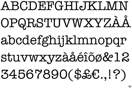
American Typewriter was designed by Joel Kaden and Tony Stan. It was released in 1974. Its classifications are serif and slab serif, as the serifs are straight. It is an old-style font.
It was designed to imitate typewriters, which were invented in the 1860's. They used to be widely used in offices and by professional writers, but they were largely replaced by personal computers and word processors by the end of the 1980's. However in some eastern parts of the world the typewriter is still prominently used.
This font was made to instil a feeling of nostalgia as it was made many decades after typewriters were widely used. Vintage/retro styles are very popular in modern society, making this font highly successful and popular. It gives off a very simplistic feel, and seems to be very focused on serving its purpose of delivering information clearly. Beatrice Ward said "type well used is an invisible type", which I think in some aspects can be related to this font. Typewriters were created solely for laying out letters neatly so they were legible and readable when put together, so I think this font started off being an "invisible type", but now has more character and connotations of stylishness in this age.
No comments:
Post a Comment