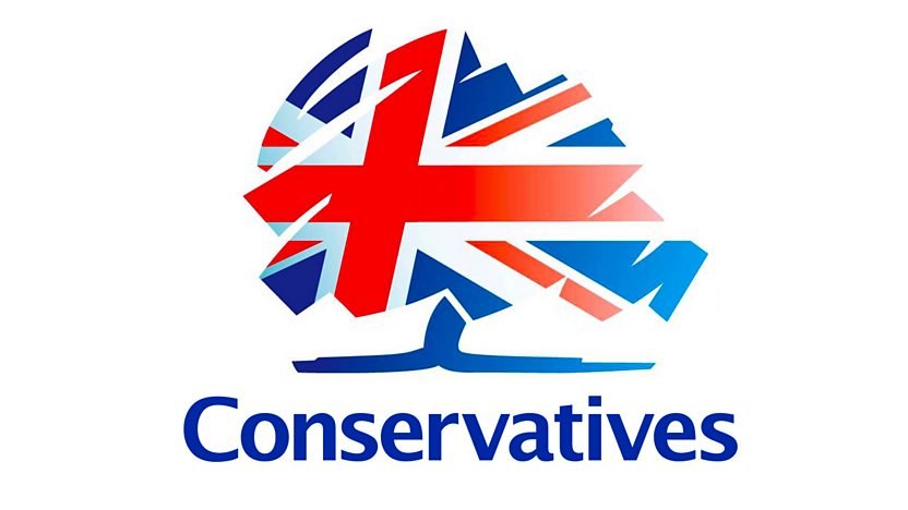
These are the logos of the main political parties that the Peace Party needs to stand out against, and not have a logo that has similarities. This would be a crucial mistake, as a similar logo might be for a party with very opposing policies. (eg Conservatives)
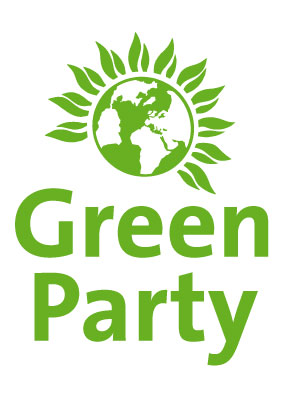
The Green party would probably be most likely to be similar to the Peace party in terms of logo, hopefully this can be completely avoided. However, as they have quite similar views, it wouldn't be as damaging, it would just be confusing for the public.
The Lib Dems are using a bird/dove image, which (like one of the Peace party candidates told me) is similar to the peace dove, which shouldn't be used here.
However, these logos will give me pointers as to how successfully represent a party.
Colour
I need to be very aware of the colours used for specific parties, as they hold strong connotations - especially labour and conservative. Blue and red are so embedded in each party that it would be a bad move to include a heavy amount of either in the Peace Party's logo.
Every other party has cleverly avoided these colours and there aren't many left that haven't been used. I think that a mixture of blue and green would give the party a unique twist, as long as the blue isn't too prominent.
These colours are most appropriate for a party that focuses on peace and the environment. Even if this is predictable, semiotics play a very important role.
No comments:
Post a Comment