Evaluate
-essay - branding used in politics
-practical - how to apply this to visual branding
This module has been vital to my learning process of the more technical and conceptual sides of graphic design. Previously, I had little knowledge on the principles of branding and how every organisation/company imaginable thrives on it.
Through creating my essay, I have researched many different sources that thoroughly investigate branding theory and politicians or political parties who have carefully used these tactics. However, I think that my essay was too broad, and would have been a more full, in depth analysis if I had focused on one political party. 3000 words was less than I thought to explore the areas I wanted to. Because of this I couldn't fully delve into the reasoning for, say, how the Nazi's manipulated Germany to gain power.
To follow on from my essay, after some thought I decided to create a visual identity for the small Peace Party, as they have little branding as it is and it was a way to hypothetically help them gain more attention from the public. It was also a morally sound choice I made as designer, which is an interesting spin to put on it as the topic of what work to take and not to take comes up a lot in graphic design discussion. I am happy with the outcome of the logo, I just wish that with more time I could have put it into practice as a reflection of the branding guidelines I created.
I found creating branding guidelines difficult and more technical than I imagined, but what I produced is very clear and has the necessary information.
Overall, I was able to put into practice what I learned from my essay, whilst taking in more visual research to inform my decisions.
Sunday, 17 May 2015
Saturday, 16 May 2015
Rebranding // Final branding guidelines
I designed the branding guidelines very simplistically and straightforward, as it is based on a serious political party where information is the product, rather than the branding of a consumer product. It does not need to look inviting or entertain the viewer, it's sole purpose is to deliver technical information about the brand.


I divided the information into small chunks that can easily be followed.


In the branding guidelines I have included some basic information about the party to introduce what factors are behind the visual identity, then going on to why the logo is designed how it is. Then came the uses of the brand.


I made sure to include the slogan that is on their website: 'Non-violence, justice, environment'. Other parties have versions of their logos with a short sentence like so, to made the party more clear in it's intentions.
The colours are displayed with the technical details for print or web use, as these colours are important to the brand and logo to represent the party and it's values.
I included the different variations of Univers, which has been used in the logo. Different weights can be used in different situations to enhance type hierarchy. However I am aware that it needs to be purchased for use, so I have made that clear to the reader.


Guidelines for adding extra details to the logo are important, as the party want it to be as accessible as possible anywhere in the country. Local parties can add their name like so.
I created the brand guidelines as a booklet using indesign, but it is also designed to work as a pdf to be accessed online.
Reasoning for a booklet version: Local parties, supporters or graphic designers for the Peace Party themselves may require a physical copy of the guide to help them with the placement of the brand and logo. It should be designed as such so that it is available at any time.
Stock: Cartridge paper, as it is of a good quality but cheap - a small party would not be able to afford very high quality paper for branding guidelines.
Reasoning for online PDF version: This makes it accessible to everybody via google search or the party's website without having to contact anyone. This encourages people to get involved with the party by giving them easily accessible resources.
Thursday, 14 May 2015
Rebranding // Logo development
Initial ideas
To start off with, I looked at the symbols (pictured in a previous post) often associated with peace, compassion, equality, non-violence etc. A lot of them are very obvious and perhaps hard to transfer into a simple logo (especially imagery with hands in).
From this I've thought deeper into the Peace Party's ideas and policies. I wanted to try out creating symbols that signify unity, connection, and inclusion - as the party is very left wing and very supportive of people struggling in this country, and also minorities. They also believe in our ability to come to non-violent conclusions with other countries, hence connecting in peaceful ways and uniting as one.

Figures holding hands in lines or circles is imagery often associated with equality and unity. I tried to figure out how they could be used in a logo, but struggled to picture something politically driven and of a serious nature.

I moved on to more subtle icons, showing connecting together and unity once again. Having segments overlap and weave through one another signifies this quite well. However, coming up with an effective shape has been difficult.


I tried out using a continuous line to create loops that show unity, and also create a symbol of people linked together. I like this idea as its a simple and clever use of negative space, while represented compassion.
I used basic clip art of figures holding hands just to try it out, but found this idea doesn't make a symbol that is effective or suitable at all sizes.
I carried through the looping idea to illustrator by drawing different versions with a tablet. I really like the shapes created, however they are way too informal for politics. They have a similar style as AirBnB, which can afford to be casual and friendly.
I recreated the same idea as a tighter and neater symbol (on the right) - this has more clarity and works better as a political logo. I may consider it, but it lacks body to it as the lines are thin. A box may need to be included around it.

This idea stemmed from my sketches of shapes connecting and overlapping to mean unity and people coming together as one. At first I created shapes overlapping, the rotated and made slight changes to experiment with it.
I prefer it as a diamond orientation, rather than square. I then warped the shape by moving connecting lines to create more dimension to the icon. This makes it seem stronger and more secure.
Some feedback I've gotten back is that it's the best idea I have, and Alex immediately said that it represented connection and security. He also pointed out that it is similar to a knot that is very strong - adding another level to my concept.
I was also told that my other idea, the loop, looks like scissors or (something rude). It's clearly not as strong.
I experimented with colours and combinations to see what works best. Blue and white - too conservative. All in colour - too heavy and affects the clarity. Hints of green and a small amount of blue - more unique and different.
I tried out different compositions with the party name, to put it into proper context. I tried to many different ones as more political logos have many to choose from as they need to fit into lots of different contexts. For now I have used the font Univers, which is very clear and readable. It is a more youthful sans serif font, that hasn't been used by the other parties.
I also tried these combinations with the other logo idea - I have a better feeling about it seeing it in this context. However, I still don't think it is serious enough and gives off playful or childish connotations. But these same features make it inviting and welcoming.
The green box brings it together a little more, but this is maybe a little too green - it seems to drown out the blue.
I decided to try out making the logo more minimal, and try to use little colours as possible, as it currently has black, green and blue. I think the effectiveness of it is taken away when the black outlines are removed, as they define the symbol and make it a lot clearer.
If any, I prefer the simplified symbol where the blue and green are overlapping (2nd in, 2nd down). This further pushes the idea of unity and connection, and uses both colours while staying minimal.
I made the logo black and white in various versions, as this needs to be available to use on ballot papers and other printed mediums where colour is unavailable or too expensive.
Using black squares makes the symbol very heavy, yet makes it stand out more. Black squares used less, make the logo appear differently. So a simple line image seems best.
Final logo in different variations:
I created different variations so that the logo can adhere to different formats, such as web, print, leaflet, ballot etc.
The logo has been created from connotations of equality and unity which suit the policies of the Peace Party, who are strongly against war and violence, and for helping unfortunate people.
Green and blue have been used to signify the environment (something they care about) and to set them clearly aside from labour and conservative. I added a small amount of blue so that they aren't associated with the Green Party, and also because too much of it would remind people of the tories.
These are the black and white versions which can be used on ballot papers and for low cost printing.
This is the other variation of the logo, that is made from a continuous line looping two figures together, to communicate connecting and compassion. The gaps in the loops are to show the different groups of people coming together, who need to work with each other in a peaceful manner.
This logo would be a back up to share with the client, who would make the final decision.
Made in black and white for ballot papers and print etc.
Wednesday, 13 May 2015
Rebranding // Existing political party branding
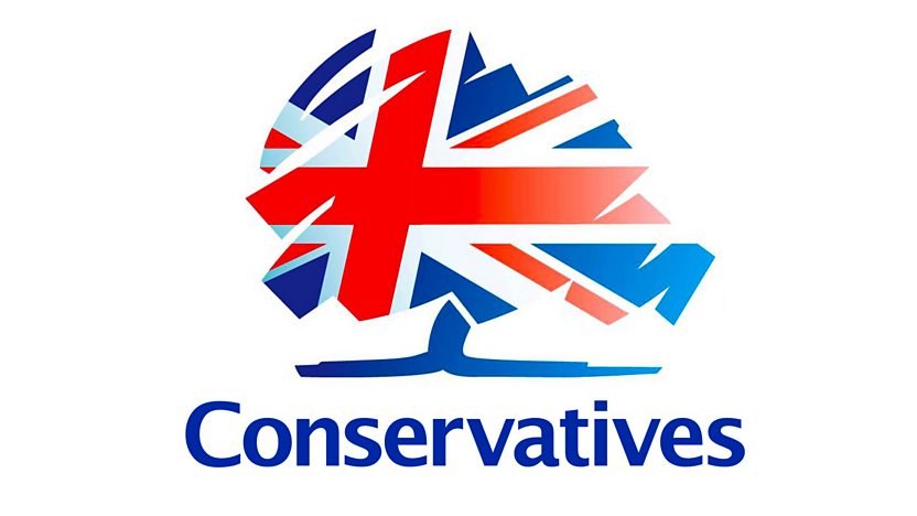
These are the logos of the main political parties that the Peace Party needs to stand out against, and not have a logo that has similarities. This would be a crucial mistake, as a similar logo might be for a party with very opposing policies. (eg Conservatives)
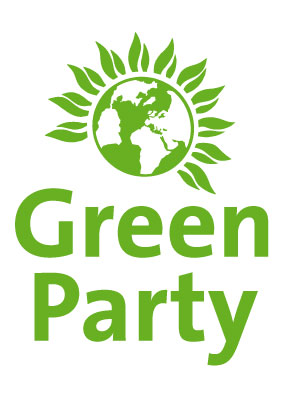
The Green party would probably be most likely to be similar to the Peace party in terms of logo, hopefully this can be completely avoided. However, as they have quite similar views, it wouldn't be as damaging, it would just be confusing for the public.
The Lib Dems are using a bird/dove image, which (like one of the Peace party candidates told me) is similar to the peace dove, which shouldn't be used here.
However, these logos will give me pointers as to how successfully represent a party.
Colour
I need to be very aware of the colours used for specific parties, as they hold strong connotations - especially labour and conservative. Blue and red are so embedded in each party that it would be a bad move to include a heavy amount of either in the Peace Party's logo.
Every other party has cleverly avoided these colours and there aren't many left that haven't been used. I think that a mixture of blue and green would give the party a unique twist, as long as the blue isn't too prominent.
These colours are most appropriate for a party that focuses on peace and the environment. Even if this is predictable, semiotics play a very important role.
Tuesday, 5 May 2015
Rebranding // The Peace Party: Branding and logo considerations
From previous research I will create the simple outlines of the party to create what will go into creating the branding.
Target audience
Brand values
Brand essence
Brand positioning
Reproducibility/adaptability
Communication
Typeface
Client needs
Communication
Branding considerations
Target audience
- Pacifists
- left-wing supporters
- people for equality and helping the least fortunate
Brand values
- equality
- non-violence
- justice
- environment
- compassion
- generosity
- co-operation
Brand essence
- Against war and poverty
Brand positioning
- strongly fighting for peace
- focusing mostly on inequality and how to fix it
- racially diverse candidates, caring about minorities
Reproducibility/adaptability
- website
- flyers/leaflets
- badges
- clothing
- ballot papers
- emails
- letter headings
Communication
- reliability & capability
- brand values, most importantly non-violence and peace
Logo requirements
Typeface
- legible and readable
- sans serif - modern and readable
Client needs
- shouldn't include peace dove or violent imagery
- include party name and depict what their party represents
Communication
- trustworthy
- peace, unity and equality
Rebranding // Research: Brand guidelines
The Barbican
(multi-arts and conference venue)
Brand guidelines
I have screenshot certain parts of the guide that would be useful - the entire guide is very clear and concise about how and where to use their logo, and other elements.
However, I am taking into account that the Barbican brand is an a completely different industry than what I am working with.


http://www.barbican.org.uk/branding/Barbican_Guidelines.pdf
Some ways in which they have described themselves:
never less than brave... and sometimes provocative
adventurous groundbreaking informed
intellectual personal bespoke inviting
captivating engaging electrifying
These brand guidelines are effective and very clear - they outline exactly why their branding is designed like it is, and clear examples of how it can be used - along with restrictions about how it can't be used in certain ways. Their brand is very particular; they only use Futura for type and their logo is just type (and ALWAYS vertical). I have taken some good points from this to help me put my branding together, but the trendy and arty layout with photography is something I need to avoid as it isn't appropriate.
Green Party
(political party)
identity guidelines


https://www.greenparty.org.uk/logos.html
These guidelines are much simpler and more technical - not about reasoning behind the logo or anything as such. This is obviously because it is a political party and it's simply for the press or supporters to use in articles or supportive material, aswell as designers.
Brand guidelines template
This is a brand guidelines template I found - while it isn't the real thing, it's quite useful for pointing out the basics that should be included.


This is useful for how to lay out the guidelines appropriately.
This is a list I've created of essential elements to include in the branding guidelines for the Peace Party.
- introduction to the party and how the branding is incorporated with it, and why.
- different logo versions and layouts, including colour and black & white
- official colours, including pantones, RGB, CMYK
- official typefaces
- customisation guidelines - adding local party names etc
I think these details are enough for a small political party, and are appropriate enough.
Subscribe to:
Comments (Atom)