This module has been vital to my learning process of more specific elements of graphic design. Previously, I had little knowledge on how important it is in marketing products to children.
Through constructing my essay, I have researched many different sources that thoroughly investigate branding theory, communication theory and colour theory. However, I think that I struggled with pulling together studies on how children perceive colour, as it has been difficult to find legitimate data. If the data I used to support my argument was my own primary research, then it possibly could have made my argument stronger and I could have analysed my findings to a better standard. However, I don't know many children at all, so this wasn't something I could have done properly anyway.
If I had given myself more time for researching outside of books, I would have contacted design studios that cater towards design for children: I did consider this, but only when it was getting a little late for that kind of research. I also thought that asking questions around the subject of manipulation in packaging for children may elicit some ungenuine responses, or very biased opinions.
In my dissertation I struggled with critical analysis, but through my writing I definitely gained a confidence in it. If I had seeked some help on this area it may have improved my writing significantly.
To coincide with my essay, after some thought I decided to create a testing of an idea. I think that this would have been a lot more valuable if I had the opportunity to put it into practice, and study children through my outcome. It then would have been more of an appropriate exploration to discover the argument of my essay in real practical terms. Unfortunately, finding children for a study is very difficult, so I wasn't able to do this.
My time management has been up and down for this module: I didn't make a strict enough time plan In September and October, but when November came I set goals for myself which I mostly did reach. When I took time off for Christmas, I made sure that beforehand I had got enough done, so that in January I wasn't too rushed. The few days before the deadline, I was very rushed to get everything finished, which taught me to next time plan even better.
Thursday, 14 January 2016
Tuesday, 12 January 2016
Research: Communication theory - books
How culture conditions the colours we see
Umberto Eco, 'The Communication Theory Reader' Edited by Paul Cobley
1996, Routledge, London
pg 159
Perception occupies a puzzling position, somewhere midway between semiotic categorization and discrimination based upon mere sensory processes.
pg 167
Human societies do not only speak of colours, but also with colours. We frequently use colours as semiotic devices: we communicate with flags, traffic lights, road signs, various kinds of emblems.
pg 169
The colours of national flags are not colours: physical pigments; they are expressions correlated to cultural units, and as such are strongly categorised.
pg 170
In everyday life, our reactivity to colour demonstrates a sort of inner and profound solidarity between semiotic systems. Just as language is determined by the way in which society sets up systems of values, things and ideas, so our chromatic perception is determined by language.
The Medium is the Massage
Marshall McLuhan
pg 26
All media work us over completely. They are so persuasive in their personal, political, economic, aesthetic, psychological, moral, ethical, and social consequences that they leave no part of us untouched, unaffected, unaltered. The medium is the massage. Any understanding of social and cultural change is impossible without a knowledge of the way media work as environments.
Understanding Media
Marshall McLuhan
The instance of the electric light may prove illuminating in this connection. The electric light is pure information. It is a medium without a message, as it were, unless it is used to spell out some verbal ad or name. This fact, characteristic of all media, means that the "content" of any medium is always another medium. The content of writing is speech, just as the written word is the content of print, and print is the content of the telegraph. If it is asked, "What is the content of speech?," it is necessary to say, "It is an actual process of thought, which is in itself nonverbal." An abstract painting represents direct manifestation of creative thought processes as they might appear in computer designs.
-
Semiotics: The Basics by Daniel Chandler
Published by Routledge, 2001
Models of the Sign
pg 13
We seem as a species to be driven by a desire to make meanings: above all, we are surely homo significans - meaning-makers. Distinctively, we make meanings through our creation and interpretation of 'signs'. Indeed, according to Peirce, 'we think only in signs' (Peirce 1931-58, 2.302). Signs take the form of words, images, sounds, odours, flavours, acts or objects, but such things have no intrinsic meaning and become signs only when we invest them with meaning. 'Nothing is a sign unless it is interpreted as a sign', declares Peirce (ibid., 2.172). Anything can be a sign as long as someone interprets it as 'signifying' something - referring to or standing for something other than itself. We interpret things as signs largely unconsciously by relating them to familiar systems of conventions. It is this meaningful use of signs which is at the heart of the concerns of semiotics.
pg 17
Saussure stressed that sound and thought (or the signifier and the signified) were as inseperable as the two sides of a piece of paper (Saussure 1983, 111). They were 'intimately linked' in the mind 'by an associative link' - 'each triggers the other' (ibid., 66). Saussure presented these elements as wholly interdependent, neither pre-existing the other.
-
Visible Signs
by David Crow
AVA Publishing SA 2003, Switzerland
pg 24
on Charles Sanders Peirce theory -
Charles Sanders Peirce is the philosopher who is recognised as the founder of the American tradition of semiotics. Whereas Saussure was primarily interested in language, Peirce was more interested in how we make sense of the world around us.
[...] This is not merely the user of the sign but a mental concept of the sign which is based on the user's cultural experience of the sign. The interpretant is not fixed. It does not have a single definable meaning, but its meaning can vary depending on the reader of the sign. The emotional response to the word 'book' will vary depending on the reader's experience of books. [...]
pg 33
Peirce defined three categories of signs;
Icon - this resembles the sign. A photograph of someone could be described as an iconic sign in that it resembles physically the thing that is represents. [...]
Index - there is a direct link between the sign and the object. In this category smoke is an index of fire and a tail is an index of a dog. Traffic signs in the street are index signs as they have a direct link to the physical reality of where they are placed such as at a junction or at the brow of a hill.
Symbol - these signs have no logical connection between the sign and what it means. They rely excusively on the reader having learnt the connection between the sign and its meaning.
pg 34
Peirce also identified three levels of properties for signs which can be mapped on to his triangular model. He labelled these properties firstness, secondness, and thirdness.
Firstness - This is a sense of something. It could be described as a feeling or a mood.
Secondness - This is the level of fact. The physical relation of one thing to another.
Thirdness - You could think of this level as the mental level. It is the level of general rules which bring the other two together in a relationship. It relates the sign to the object as a convention.
pg 57
(Roland Barthes) Denotation - what is pictured
This first order of signification is straightforward. It refers to the physical reality of the object which is signified. [...]
Connotation - how it is pictured
[...] The reader is playing a part in this process by applying their knowledge of the systematic coding of the image. In doing this the meaning is affected by the background of the viewer. [...]
Connotation is arbitrary in that the meanings brought to the image at this stage are based on rules or conventions which the reader has learnt.
pg 58
Convention
This is an agreement about how we should respond to a sign. [...] So much of the meaning comes from convention that signs with little convention need to be very iconic in order to communicate to a wide audience.
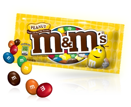


Research: Packaging
PACKAGING
Package Design Now! - Gisela Kozak, Julius Wiedemann

pg 21
This concept links HEALTHY products with healthy packaging and provides a tactile collectible toy for babies to play with while mum bathes them. The packaging reinforces the safe gentle qualities of the product inside.

The product range consists of approximately 20 products, so clear product differentiation was needed to make the range easy for the customer to shop. Unlike most M&S products, there were no inherent food values to showcase - the proposition was one of fun, impromptu snacking. The range is mainly aimed at customers with young families, though there are older customers who buy the snacks for the nostalgia factor. One thing that separates these products from the rest of the savoury category is that their shapes are all individual. Therefore it was felt making the product hero and using bold metallic colours would give each pack a clear identity. The playful use of a verbal and visual pun brought a fun element to the packaging. Mandatory product copy appears in a simple coloured corner panel which is common to all packaging in this category.

Inspired
by baby bottles, toys and teething rings, Tatil developed an ergonomic
packaging line to offer comfort and fun to the kids. During and after
its use, each packaging turned into a toy in order to stimulate
imagination and games. This redesign included ring toss, soap bubbles,
inflatable soap dishes, funny shaped sponges and lots of colours.

This
particular bottle idea was conceived as a way of engendering the
dullness of kids' drinks packaging with the personality of animals. The
form is both highly feasible and hugely characterful; a chameleon form
capable of becoming a range of animal types through colour and
decoration. The bottles will stack for both play at point-of-sale and,
of course, at home. The design has been tooled and awaits a suitable
license, but the Tin Horse Design Team was interested in a
differentiated product.
Research: Colour - Journals, papers and studies
Color sells: How the psychology of color influences consumers
Sarah Tornetta, Tess Fox, Jordan Blackbird
http://udel.edu/~rworley/e412/Psyc_of_color_final_paper.pdf
Color sells products. It is a powerful marketing tool that significantly influences consumer purchases, so much so that it accounts for 85% of the reason why someone decides to purchase a product
(Hemphill 275). Marketers must understand the psychology of color in order to use it effectively.
It is necessary to define the three basic principles of color, hue, saturation, and value, to understand associative learning (see fig.1).
Hue is the wavelength of a color and determines its label, such as orange or green. Saturation is the intensity of a color, or, how pigmented a color is. Value is how bright a color is. Together, these three factors determine how people perceive color and thus the associations they form with it.
Implementing color associations in package designs
Marketers use color associations to increase product sales by sending a message to the consumer (see fig. 2). Crest 3D Whitestrips, for example, consists primarily of blue. Blue is associated with cleanliness, emphasizing the product’s promise of clean, white teeth. White’s association with purity makes it the ideal accent color.
Nature Valley Granola Bars are packaged in a green and yellow box. Green is associated with nature and the outdoors, which is appropriate for this product’s sales pitch of wholesome, all-natural, and healthy ingredients. Furthermore, it is the easiest color for the eyes to process. Yellow is associated with sunshine and optimism, promoting the product in a warm and positive manner.
Apple’s black iPhone box demonstrates the effective use of black in packaging. Although black is linked to death and evil in specific contexts, in this context it is associated with power and luxury. Apple’s products are expensive and the color black aids in selling the product as an exclusive, high-‐quality item. Black is often the color of choice for electronics and other luxury items.
Establishing brand recognition with color
Brand recognition is the consumer’s ability to identify or associate a product with a brand. Marketers establish brand recognition by using a specific formula of colors and shapes to form a brand mark. The key is consistency; the same colors must be present across all facets of a company. For example, acompany’s website should be visually relatable to its store and consumer products. Researchers at the University of Loyola found that color increases brand recognition by up to 80%. (Morton “Why Color Matters”). In another study, when a group of people were shown ‐second advertisements, over 62% developed an association to a brand based purely on the colors they saw (Chang and Lin 3345). Brand recognition has a large impacton consumer purchasing behavior. Aside from impulse shoppers, many shoppers seek out products of brands they recognize. Successful color manipulation enables shoppers to quickly and easily identify the brand they are looking for amongst a sea of similar products. Once a company succeeds at establishing brand recognition, it can temporarily manipulate trademark colors to add interest to a product. Heinz, which successfully established brand recognition by using the color red, introduced EZ Squirt Blastin’ Green ketchup in October 2000. This dramatic alteration from the familiar deep red ketchup bottles boosted product sales by $23 million. Consumers had developed such strong associations between Heinz and red ketchup bottles that the green bottles attracted attention and drew interest. This illustrates just how powerful colour can be.


COLOUR ASSOCIATIONS study
http://www.joehallock.com/edu/COM498/associations.html
Global Color Survey
http://www.colorcom.com/global-color-survey
Thanks for taking the Global Color Survey.
Over 200,00 people from all points on the globe have taken the survey. Here are the results:
Happy - Yellow
Pure - White
Good Luck - Green
Good-tasting - Red (tomato)
Dignity - Dark Blue
High Technology - Silver
Sexiness - Red (tomato)
Mourning - Black
Expensive - Gold
Inexpensive - Brown
Powerful - Red (tomato)
Dependable - Blue
High Quality - Gold
Nausea - Muted Yellow
Deity - White
Bad Luck - Black
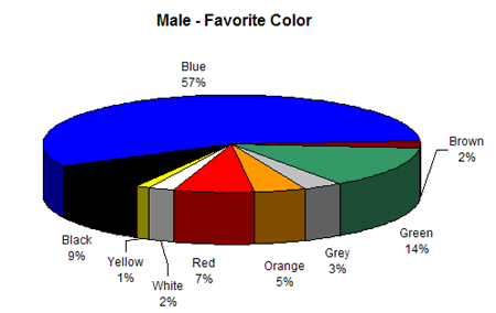
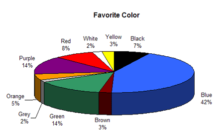
Favorite Color - Blue
Least Favorite Color - Dark Yellow
The Button Test
http://blog.hubspot.com/blog/tabid/6307/bid/20566/The-Button-Color-A-B-Test-Red-Beats-Green.aspx
Impact of Color on Marketing
Satyendra Singh (Department of Administrative Studies, University of Winnipeg, Winnipeg, Canada)
(2006), Management Decision, Vol. 44 Iss: 6 pp. 783 - 789
http://www.emeraldinsight.com/doi/abs/10.1108/00251740610673332
researchers found that up to 90% of snap judgments made about products can be based on color alone (depending on the product).
Exciting Red and Competent Blue
Lauren I. Labrecque, George R. Milne
Journal of the Academy of Marketing Science, September 2012, Volume 40, Issue 5, pp 711-727
http://link.springer.com/article/10.1007%2Fs11747-010-0245-y
Purchasing intent is greatly affected by colors due to the impact they have on how a brand is perceived. This means that colors influence how consumers view the "personality" of the brand in question.
Color Research and Application
Edited By: Ellen C. Carter
Additional studies have revealed that our brains prefer recognizable brands, which makes color incredibly important when creating a brand identity. It has even been suggested in Color Research & Application that it is of paramount importance for new brands to specifically target logo colors that ensure differentiation from entrenched competitors (if the competition all uses blue, you'll stand out by using purple).
Visual and instrumental evaluation of orange juice color: A consumers's preference study
The Isolation Effect in Free Recall and Recognition
Gerrit van Dam, Joan Peeck, Michèle Brinkerink and Usmar Gorter
The American Journal of Psychology
http://www.jstor.org/stable/1421391
The psychological principle known as the Isolation Effect states that an item that "stands out like a sore thumb" is more likely to be remembered. Research clearly shows that participants are able to recognize and recall an item far better (be it text or an image) when it blatantly sticks out from its surroundings.
Colours and Emotions: Preferences and Combinations
Mark Meerum Terwogt and Jan B. Hoeksma, The Journal of General psychology, 122(1), 5-17
http://irtel.uni-mannheim.de/lehre/expra/artikel/Terwogt_Hoeksma_1995.pdf
According to our hypothesis, highly preferred colours should be tied to highly preferred emotions, whereas non-preferred colours should be tired to non-preferred emotions. At the same time, a preferred colour is not likely to be tied to a non-preferred emotion or vice versa.

Sarah Tornetta, Tess Fox, Jordan Blackbird
http://udel.edu/~rworley/e412/Psyc_of_color_final_paper.pdf
Color sells products. It is a powerful marketing tool that significantly influences consumer purchases, so much so that it accounts for 85% of the reason why someone decides to purchase a product
(Hemphill 275). Marketers must understand the psychology of color in order to use it effectively.
It is necessary to define the three basic principles of color, hue, saturation, and value, to understand associative learning (see fig.1).
Hue is the wavelength of a color and determines its label, such as orange or green. Saturation is the intensity of a color, or, how pigmented a color is. Value is how bright a color is. Together, these three factors determine how people perceive color and thus the associations they form with it.
Implementing color associations in package designs
Marketers use color associations to increase product sales by sending a message to the consumer (see fig. 2). Crest 3D Whitestrips, for example, consists primarily of blue. Blue is associated with cleanliness, emphasizing the product’s promise of clean, white teeth. White’s association with purity makes it the ideal accent color.
Nature Valley Granola Bars are packaged in a green and yellow box. Green is associated with nature and the outdoors, which is appropriate for this product’s sales pitch of wholesome, all-natural, and healthy ingredients. Furthermore, it is the easiest color for the eyes to process. Yellow is associated with sunshine and optimism, promoting the product in a warm and positive manner.
Apple’s black iPhone box demonstrates the effective use of black in packaging. Although black is linked to death and evil in specific contexts, in this context it is associated with power and luxury. Apple’s products are expensive and the color black aids in selling the product as an exclusive, high-‐quality item. Black is often the color of choice for electronics and other luxury items.
Establishing brand recognition with color
Brand recognition is the consumer’s ability to identify or associate a product with a brand. Marketers establish brand recognition by using a specific formula of colors and shapes to form a brand mark. The key is consistency; the same colors must be present across all facets of a company. For example, acompany’s website should be visually relatable to its store and consumer products. Researchers at the University of Loyola found that color increases brand recognition by up to 80%. (Morton “Why Color Matters”). In another study, when a group of people were shown ‐second advertisements, over 62% developed an association to a brand based purely on the colors they saw (Chang and Lin 3345). Brand recognition has a large impacton consumer purchasing behavior. Aside from impulse shoppers, many shoppers seek out products of brands they recognize. Successful color manipulation enables shoppers to quickly and easily identify the brand they are looking for amongst a sea of similar products. Once a company succeeds at establishing brand recognition, it can temporarily manipulate trademark colors to add interest to a product. Heinz, which successfully established brand recognition by using the color red, introduced EZ Squirt Blastin’ Green ketchup in October 2000. This dramatic alteration from the familiar deep red ketchup bottles boosted product sales by $23 million. Consumers had developed such strong associations between Heinz and red ketchup bottles that the green bottles attracted attention and drew interest. This illustrates just how powerful colour can be.
Colour Preferences
http://www.joehallock.com/edu/COM498/preferences.html
COLOUR ASSOCIATIONS study
http://www.joehallock.com/edu/COM498/associations.html
Global Color Survey
http://www.colorcom.com/global-color-survey
Thanks for taking the Global Color Survey.
Over 200,00 people from all points on the globe have taken the survey. Here are the results:
Happy - Yellow
Pure - White
Good Luck - Green
Good-tasting - Red (tomato)
Dignity - Dark Blue
High Technology - Silver
Sexiness - Red (tomato)
Mourning - Black
Expensive - Gold
Inexpensive - Brown
Powerful - Red (tomato)
Dependable - Blue
High Quality - Gold
Nausea - Muted Yellow
Deity - White
Bad Luck - Black
Favorite Color - Blue
Least Favorite Color - Dark Yellow
The Button Test
http://blog.hubspot.com/blog/tabid/6307/bid/20566/The-Button-Color-A-B-Test-Red-Beats-Green.aspx
Impact of Color on Marketing
Satyendra Singh (Department of Administrative Studies, University of Winnipeg, Winnipeg, Canada)
(2006), Management Decision, Vol. 44 Iss: 6 pp. 783 - 789
http://www.emeraldinsight.com/doi/abs/10.1108/00251740610673332
researchers found that up to 90% of snap judgments made about products can be based on color alone (depending on the product).
Exciting Red and Competent Blue
Lauren I. Labrecque, George R. Milne
Journal of the Academy of Marketing Science, September 2012, Volume 40, Issue 5, pp 711-727
http://link.springer.com/article/10.1007%2Fs11747-010-0245-y
Purchasing intent is greatly affected by colors due to the impact they have on how a brand is perceived. This means that colors influence how consumers view the "personality" of the brand in question.
Color Research and Application
Edited By: Ellen C. Carter
ISI Journal Citation Reports © Ranking: 2014: 85/135 (Engineering Chemical)
http://onlinelibrary.wiley.com/journal/10.1002/(ISSN)1520-6378Additional studies have revealed that our brains prefer recognizable brands, which makes color incredibly important when creating a brand identity. It has even been suggested in Color Research & Application that it is of paramount importance for new brands to specifically target logo colors that ensure differentiation from entrenched competitors (if the competition all uses blue, you'll stand out by using purple).
Visual and instrumental evaluation of orange juice color: A consumers's preference study
ROCÍO FERNÁNDEZ-VÁZQUEZ et al. Journal of Sensory Studies
http://onlinelibrary.wiley.com/doi/10.1111/j.1745-459X.2011.00360.x/abstract
When it comes to picking the “right” color, research has found that predicting consumer reaction to color appropriateness in relation to the product is far more important than the individual color itself. So, if Harley owners buy the product in order to feel rugged, you could assume that the pink + glitter edition wouldn't sell all that well.The Isolation Effect in Free Recall and Recognition
Gerrit van Dam, Joan Peeck, Michèle Brinkerink and Usmar Gorter
The American Journal of Psychology
http://www.jstor.org/stable/1421391
The psychological principle known as the Isolation Effect states that an item that "stands out like a sore thumb" is more likely to be remembered. Research clearly shows that participants are able to recognize and recall an item far better (be it text or an image) when it blatantly sticks out from its surroundings.
Colours and Emotions: Preferences and Combinations
Mark Meerum Terwogt and Jan B. Hoeksma, The Journal of General psychology, 122(1), 5-17
http://irtel.uni-mannheim.de/lehre/expra/artikel/Terwogt_Hoeksma_1995.pdf
According to our hypothesis, highly preferred colours should be tied to highly preferred emotions, whereas non-preferred colours should be tired to non-preferred emotions. At the same time, a preferred colour is not likely to be tied to a non-preferred emotion or vice versa.
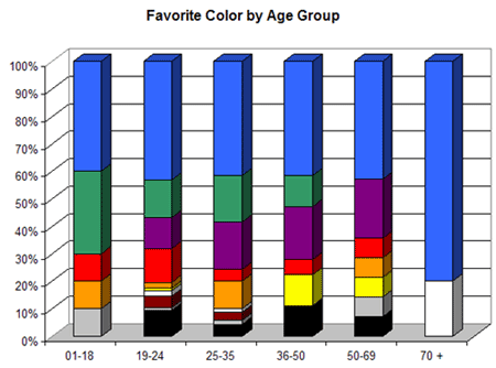
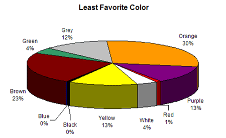
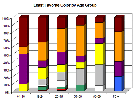
Research // Children: colours and emotions

https://en.wikipedia.org/wiki/Emotion

http://musingsofanaspie.com/tag/aspergers-tests/


Research: Branding - books
Corporate Identity
by Wally Olins
1989, Thames and Hudson, London
pg 7
The identity of the corporation must be so clear that it becomes the yardstick against which its products, behaviour and actions are measured.
This means that the identity cannot simply be a slogan, a collection of phrases: it must be visible, tangible and all-embracing.
In the sprawling, complex corporations with which this book is mostly concerned, where innumerable interests - each supported by individuals - conflict and compete for power and influence, the company's long-term purpose, its values, its identity must be managed consciously and clearly, or they will be overwhelmed and disregarded in sectional infighting. The organisation will simply become an inert victim of the various factions that seek to control it.
pg 9
Identity is expressed in the names, symbols, logos, colours and rites of passage which the organisation uses to distinguish itself, its brands and its constituent companies. At one level, these serve the same purpose as religious symbolism, chivalric heraldry or national flags and symbols: they encapsulate and make vivid a collective sense of belonging and purpose. At another level, they represent consistent standards of quality and therefore encourage consumer loyalty.
[This book] It also takes the view that the corporation is, whether it likes it or not, becoming more closely integrated into society, and that society is becoming increasingly judgmental about the behaviour and actions of corporations.We are entering an epoch in which only those corporations making highly competitive products will survive. This means, in the longer term, that products from the major competing companies around the world will become increasingly similar. Inevitably, this means that the whole of the company's personality, its identity, will become the most significant factor in making a choice between one company and its products and another.
pg 29
Corporate identity is concerned with four major areas of activity:
Products/services - what you make or sell
Environments - where you make or sell it - the place of physical context
Information - how you describe and publicize what you do
Behaviour - How people within the organization behave to each other and to outsiders
All of these communicate ideas about the company. But in fact the entire corporation communicates in everything it does all the time. The fact that the company exists at all is itself a form of communication. The potency of different forms of communication varies, however, together with the degree to which they are modulated.
pg 33
Because communication, more particularly advertising and packaging, gives life and personality to consumer products, advertising especially has become a prism through which many products that we use in everyday life - fizzy drinks, soaps, toothpaste, breakfast cereals - are projected. Almost inevitably, therefore, many people have come to associate advertising with identity, or with image.
This is a misleading and potentially dangerous idea, because it has the effect of devaluing the real power of product, environment and behaviour in the identity mix, at the risk of overvaluing information techniques.
Perhaps even more importantly though, the idea that identity is somehow inextricably associated with conventional communication techniques, and particularly with advertising, inevitably distorts the reality, which is that identity is usually a manifestation of what the organization is all about; and that in the end, identity is the responsibility of the people who run the organization and not only of its designers, public relations people or advertising agencies.
pg 35
Increasingly therefore, we, the public, are having to make a choice between one company, one product or one service and another on the basis of factors that are very difficult to quantify, such as reputation. It's certain that the companies with good products and powerful, well-coordinated identities, will beat their competitors whose products are just as good, but whose identities are weak.
pg 45
New techniques in information technology, market research and production are increasingly driving successful manufacturers into making products that are alike in all tangible and quantifiable characteristics - price, quality and service, and even to a certain extent appearance.
pg 56
One way or another, whether they are conscious of it or not, most commercial organizations use design to delineate their relationship with their customers.
pg 78
If a company has, say, five divisions and it uses one name, one set of colours, one symbol and typestyle in all of them, it will convey a simple, centralized idea of itself. If the same company gives each division a seperate colour, it will inevitably project a more decentralized identity. And if it uses different names, symbols and logotypes for each division, it will give an even more disparate impression. The identity resource can clarify an organization's structure - and enable its purpose and its shape to emerge clearly.
pg 115
Once the idea of separate target audiences grew up, the permutations were endless. You could produce a whole range of products aimed at different groups; it didn't really matter if the intrinsic difference between the products was negligible, providing they all had individual names and packaging, and were promoted separately in ways appropriate to each target audience.
Branding soon became the magic ingredient that enabled companies to sell variations of a single product to the greatest possible variety of people.
Branding is one of the most powerful ways of promoting a product. The greatest single strength of the brand is that, because it is created carefully and deliberately to appeal to a particular group of people at a particular point in time, it can be imbued with powerful, complex, highly charged and immediate symbolism aimed at a specific marketplace.
Over the last generation the change that has been taking place in the retail stores in many countries has been revolutionary - almost as revolutionary as the growth of the manufacturer's brand itself at an earlier period. Where the branded products were king for over a century, while the retailer was for the most part supine, the monolithic identity has now been 'discovered' by the retailer. In a sense we could say that the retailer has found his strengths and suddenly emerged from nowhere to take a vast slice of the market. In certain countries and in some kinds of market, retailers with monolithic identities in environment (shops), information systems (packaging and advertising) and products are busily knocking the traditional branded manufacturers cock-eyed.
Understanding Brands
by Don Cowley
1991 by Kogan Page Limited
BRAND PACKAGING
pg 137
Ideally it should project a personality, instil loyalty, forge emotional links, and actively persuade people to ‘buy me’.
Packaging
design has become ‘active’. An exciting new agenda has been set which
combines the creative with the commercial, and explores the intuitive
alongside the rational.
Pg 139
It
must flag down the prospect in mass display; involve on an emotional
level, strike a chord, touch a nerve; symbolise the brand’s core
proposition and differentiate it from the competition; project the
brand’s personality; persude and seduce; communicate information;
provide a functional cover for the product in transit and in the home;
and be ecologically friendly.
The Corporate Brand
by Nicholas Ind, 1997, Macmillan Press Ltd, Hampshire
by Nicholas Ind, 1997, Macmillan Press Ltd, Hampshire
CYNICISM OF CONSUMERS
pg 20
With
consumer confidence also comes cynicism. Consumers do not necessarily
believe what companies tell them about themselves or their products. The
growing distrust of institutions and in particular central government
is borne out of us knowing more than ever before about the realities of
what goes on and the accumulated evidence of broken promises.
CHEAP ALTERNATIVES
Pg 23
If
the consumer fails to perceive a relevant and distinctive appeal in a
brand, then they will purchase a less expensive alternative.
No Logo
Naomi Klein, 2005, Harper Perennial, London
BRAND NOT PRODUCT
Pg 4
These
pioneers made the bold claim that producing goods was only an
incidental part of their operations, and that thanks to recent victories
in trade liberalisation and labor-law reform, they were able to have
their products made for them by contractors, many of them overseas. What
these companies produced primarily were not things, they said, but images of their brands. Their real work lay not in manufacturing but in marketing.
This formula, needless to say, has proved enormously profitable, and
its success has companies competing in a race toward weightlessness:
whoever owns the least, has the fewest employees on the payroll and
produces the most powerful images, as opposed to products, wins the
race.
Pg 5
Since many of today’s best-known manufacturers no longer produce products and advertise them, but rather buy products and “brand” them, these companies are forever on the prowl for creative new ways to build and strengthen their brand images.
COMPETITIVE BRANDING
Pg 6
What
made early branding efforts different from more straightforward
salesmanship was that the market was not being flooded with uniform
mass-produced products that were virtually indistinguishable from one another.
The first task of branding was to bestow proper names on generic goods such as sugar, flour, soap and cereal, which had previously been scooped out of barrels by local shopkeepers.
ITS A CULTURE
Pg 30
It
is not to sponsor culture but to be the culture. And why shouldn’t it
be? If brands are not products but ideas, attitudes, values and
experiences, why can’t they be culture too?
Subscribe to:
Comments (Atom)